
Salesforce is widely used to manage customer, sales, service, partner, and operational data. However, much of that information is traditionally presented through records, tables, reports, and dashboards.
For businesses that operate across multiple geographic locations, there is another dimension that can make Salesforce data easier to understand: location.
Interactive maps can help organizations visualize customers, accounts, opportunities, service locations, partners, assets, and other geographically relevant data. Instead of reviewing hundreds of records individually, users can see how information is distributed across countries, regions, and locations.
One approach is to combine Salesforce data with a JavaScript-based mapping library such as jsVectorMap, creating a customized geographic visualization experience within a broader Salesforce application.
At AwsQuality, we worked on a client requirement involving an interactive map visualization experience for Salesforce. The project demonstrates how geographic visualization can be incorporated into an enterprise application to provide a more visual way of working with location-based information.
This article explores the concept, architecture, use cases, technical considerations, and implementation approach behind interactive map visualization in Salesforce.
What is Interactive Map Visualization in Salesforce?
Interactive map visualization in Salesforce is the presentation of geographically relevant Salesforce data through an interactive map interface.
Instead of displaying information only as records or charts, the application can associate Salesforce data with geographic regions or specific locations.
For example, an organization could visualize:
- Customers by country
- Leads by state
- Opportunities by territory
- Service locations
- Partner locations
- Retail stores
- Distribution centers
- Assets
- Field operations
- Project locations
A simplified flow looks like this:
Salesforce Data
 ↓
 Geographic Information
 ↓
 Map Visualization
 ↓
 Interactive User Experience
 ↓
 Business Analysis
The map becomes a visualization layer over business information rather than replacing Salesforce as the underlying system of record.
Read: Salesforce AIforce – The Complete Guide to Salesforce’s New Agentic Integration Layer
Why Add Maps to Salesforce Applications?
Salesforce already provides powerful reporting and dashboard capabilities. However, tables and charts don’t always communicate geographic relationships effectively.
Consider a company with customers across 20 countries.
A report can show:
| Country | Customers | Revenue |
|---|---|---|
| United States | 1,250 | $25M |
| Canada | 420 | $7M |
| Germany | 310 | $6M |
| India | 580 | $8M |
The data is useful, but users still have to mentally translate the information into a geographic picture.
An interactive map provides another way to interpret the same information.
Geographic Data
 ↓
 Visual Representation
 ↓
 Regional Patterns
 ↓
 Faster Exploration
This can be particularly useful when where something happens is as important as what happened.
Also read: 15 Types of Salesforce Clouds and Their Features
A Look at the Interactive Map Experience
The following examples illustrate two different approaches to geographic visualization.
Regional Visualization
The first image demonstrates an interactive world map where specific geographic regions can be visually highlighted.
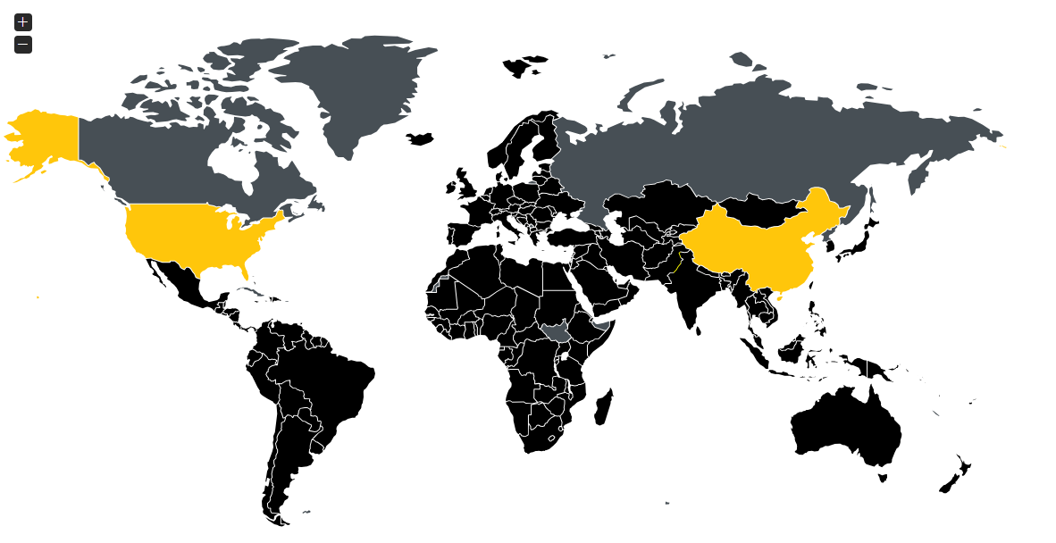
Interactive world map visualization showing selected geographic regions.
This type of visualization can be useful for applications where users need to understand data at the country or regional level.
Potential examples include:
- Revenue by country
- Customers by market
- Opportunities by territory
- Regional sales activity
- Geographic coverage
Regional + Location Marker Visualization
The second example introduces location markers in addition to regional highlighting.
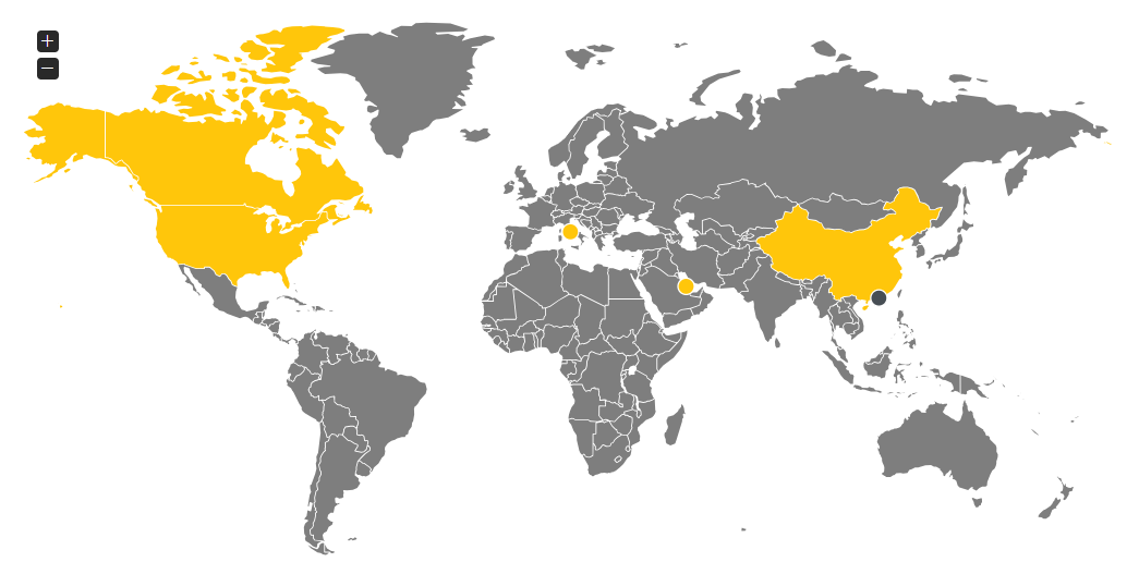
Interactive map combining regional visualization with location markers.
Markers can represent specific business locations, while the highlighted regions provide broader geographic context.
Depending on the application, a marker could represent:
- A customer
- A Salesforce account
- A store
- A service location
- A partner
- A project
- A warehouse
- An opportunity
- An asset
This combination can make the map useful at both a regional and location-specific level.
Check out: How AI Agents and Salesforce are Redefining Customer Service
How jsVectorMap Fits Into the Architecture
jsVectorMap is a lightweight JavaScript library designed for interactive maps and data visualization. It supports functionality such as regions, markers, tooltips, zooming, selection, and other interactive behaviors.
For a Salesforce-oriented application, a mapping library can act as the visualization layer, while Salesforce continues to provide the underlying business data.
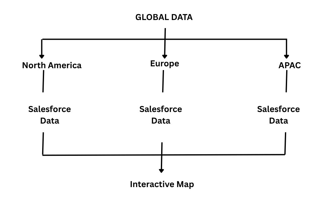
Conceptually:
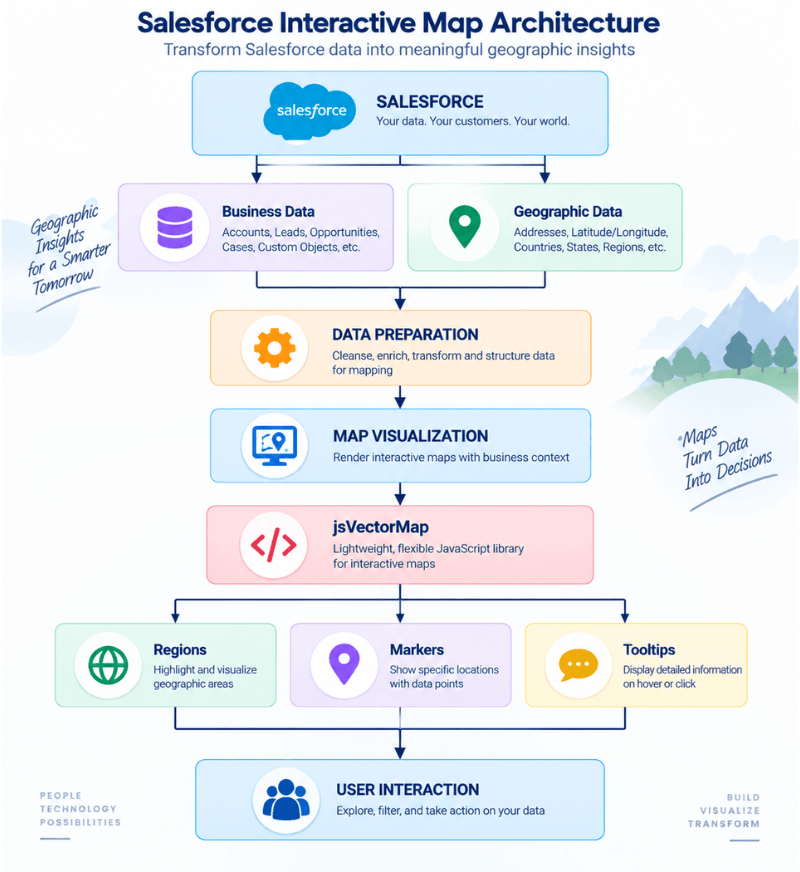
The exact Salesforce implementation depends on the organization’s architecture, data model, security requirements, and desired user experience.
Visualizing Salesforce Data by Region
One of the simplest applications of an interactive map is region-level visualization.
A business may want to understand how its Salesforce data is distributed across:
- Countries
- States
- Territories
- Sales regions
- Markets
For example:
The map can associate a value with a particular geographic region and provide a visual representation of that data.
This can help users explore geographic patterns without navigating through multiple reports.
Using Markers for Specific Salesforce Locations
Region-level visualization is useful for high-level analysis, but some applications require more granular information.
This is where markers become useful.
A marker can represent a specific geographic coordinate.
For example:
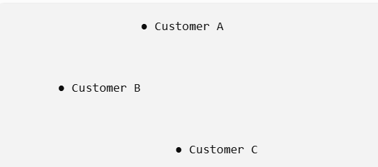
A marker could correspond to a Salesforce record containing location information.
For example:
Account → Address → Latitude/Longitude → Map Marker
This makes it possible to visualize individual locations rather than only aggregated regional information.
Also check: Agentforce vs Claudeforce – Features, Capabilities, Use Cases, and Differences
Tooltips Provide Additional Information
A map should not attempt to display every piece of information directly on the screen.
Instead, interactive elements can provide additional context when users hover over or select them.
For example:
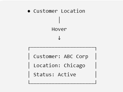
Tooltips can potentially display information such as:
- Customer name
- Account status
- Opportunity value
- Location
- Sales representative
- Service status
- Other relevant business information
This approach keeps the primary map interface clean while allowing users to access more detail when required.
Interactive Maps Can Become Part of the Salesforce Workflow
A map does not have to be a passive visualization.
With appropriate application logic, interactions with geographic elements can become part of the broader user workflow.
For example:
User selects region
 ↓
 Region interaction
 ↓
 Filter Salesforce records
 ↓
 Display matching records
 ↓
 User opens record
 ↓
 Salesforce record details
Similarly, selecting a marker could potentially open additional information associated with the underlying business record.
This changes the map from a simple visualization into an interactive application component.
Potential Use Cases for Salesforce Map Visualization
The business value of an interactive map depends on the type of information an organization manages.
1. Customer Distribution
Organizations with geographically distributed customers can use maps to visualize customer concentration.
Potential insights include:
- Customer distribution
- Geographic concentration
- Market coverage
- Regional customer growth
2. Sales Territory Visualization
Sales organizations can visualize accounts, prospects, and opportunities across territories.
For example:
Territory
↓
Accounts
↓
Opportunities
↓
Revenue
This can complement traditional Salesforce reports by adding geographic context.
3. Lead Distribution
Sales and marketing teams can visualize leads geographically.
This could help users explore:
- Lead concentration
- Regional campaigns
- Market activity
- Geographic demand
4. Field Service Locations
Organizations with field operations can visualize service locations and other operational information geographically.
Potential map elements could include:
- Customers
- Service locations
- Assets
- Field resources
- Open cases
The exact capabilities required would determine whether Salesforce Maps, another mapping solution, or a custom visualization is appropriate.
5. Partner Network Visualization
Businesses with geographically distributed partners can visualize their ecosystem.
For example:
Partner Network
│
├── North America
├── Europe
├── Middle East
└── Asia-Pacific
This can provide management teams with a visual representation of geographic coverage.
6. Retail and Store Locations
Retail organizations can visualize stores, outlets, franchises, or distribution points.
The map could potentially connect location information with Salesforce records containing:
- Store information
- Sales performance
- Customer activity
- Operational status
7. Asset Visualization
For organizations managing geographically distributed assets, a map can provide an additional way to locate and explore those assets.
Potential examples include:
- Equipment
- Infrastructure
- Vehicles
- Devices
- Industrial assets
Read: Why your Salesforce implementation isn’t delivering results
The Importance of Geographic Data
A map is only as useful as the geographic information behind it.
Salesforce records may contain:
- Street address
- City
- State
- Country
- Postal code
- Latitude
- Longitude
For reliable geographic visualization, this information needs to be accurate and consistently structured.
Consider these examples:
 New York
 New York, NY
 NYC
 New York City
Humans can generally understand the relationship between these values, but software systems require structured information to reliably associate records with geographic locations.
This makes data quality an important part of map implementation.
Common Geographic Data Challenges
Organizations may encounter issues such as:
Missing location information
Some records may not contain complete addresses.
Incorrect addresses
Outdated or incorrectly entered addresses can result in inaccurate locations.
Inconsistent formatting
Different teams may enter geographic information differently.
Duplicate locations
Multiple records may represent the same physical location.
Missing coordinates
Some use cases require latitude and longitude rather than text-based addresses.
Outdated information
Businesses relocate, customers change addresses, and assets move.
A strong implementation should therefore consider data quality before focusing solely on the visual interface.
Check: How to Migrate to Salesforce Without Losing Your Data
Performance Considerations for Enterprise Map Applications
Enterprise Salesforce environments can contain large amounts of data.
Trying to display every record on a map at the same time may negatively affect usability and performance.
For example:
 1,000,000 Salesforce Records
 ↓
 Filtering
 ↓
 Aggregation
 ↓
 Relevant Records
 ↓
 Interactive Map
Potential techniques include:
- Filtering
- Aggregation
- Lazy loading
- Pagination
- Region-level summaries
- Selective marker rendering
- Data reduction
- Server-side processing
The objective should not simply be to display as much data as possible.
The objective is to display the right data at the right level of detail.
Security Considerations
Salesforce data can contain sensitive customer and business information.
When that information is represented visually, security remains important.
Organizations should consider:
- User permissions
- Object-level permissions
- Field-level security
- Record-level access
- Authentication
- Authorization
- Sensitive location information
- Data exposure
For example, a user who cannot access a Salesforce record should not receive information about that record simply because it is represented on a map.
Therefore, the visualization layer should be designed with the application’s Salesforce security model in mind.
Salesforce Maps vs. Custom Map Visualization
Salesforce already offers Salesforce Maps, which provides mapping capabilities for Salesforce data and supports use cases such as visualizing records and planning routes.
That raises an important question:
When should an organization consider custom map development?
The answer depends on the requirements.
Salesforce Maps can be appropriate when an organization needs established mapping functionality and field-oriented workflows.
A custom visualization may be considered when the organization requires a specialized:
- User interface
- Visualization
- Workflow
- Interaction model
- Data presentation
- Custom-object experience
- Application integration
The objective should not be to build something custom simply because it is possible.
The organization should first determine whether existing Salesforce functionality meets the requirement.
Why Custom Salesforce Development Can Help
Custom development becomes particularly relevant when standard functionality doesn’t fully align with a business requirement.
For example, an organization might need:
A customized interface
The map can be designed around a specific user workflow.
Specialized visualization
Business-specific metrics can be represented through regions or markers.
Custom interactions
Users can interact with map elements according to application requirements.
Integration with existing applications
The visualization can become part of an existing Salesforce application rather than a separate system.
Support for specialized data models
Custom Salesforce objects and business processes may require a tailored visualization approach.
Designing the User Experience
Technical implementation is only one part of the project.
A map can contain many interactive elements, but if users cannot understand what they are seeing, the visualization provides limited value.
A well-designed experience should answer questions such as:
- What does this region represent?
- What does this marker represent?
- What happens when I click it?
- Can I filter the data?
- Can I search for a location?
- Can I zoom into a particular area?
- Can I access the underlying Salesforce record?
Useful interface components can include:
- Search
- Filters
- Zoom controls
- Region selection
- Markers
- Tooltips
- Legends
- Reset controls
- Data summaries
The screenshots above demonstrate this principle by combining map navigation with geographic highlighting and location markers.
A Practical Development Approach
Building an interactive Salesforce map can be approached through several stages.
Step 1: Define the Business Requirement
Start with the business problem rather than the technology.
Determine:
- Who will use the map?
- What information needs to be visualized?
- Why does geography matter?
- What decisions should the visualization support?
Step 2: Identify the Salesforce Data
Determine which Salesforce objects and fields contain the relevant information.
Examples could include:
- Accounts
- Leads
- Opportunities
- Cases
- Custom objects
- Location-related records
Step 3: Assess Geographic Data
Review:
- Addresses
- Coordinates
- Country information
- State information
- Territory information
- Data consistency
Step 4: Design the Map Experience
Define:
- Map type
- Regions
- Markers
- Tooltips
- Filters
- Interactions
- Zoom behavior
- Supporting information
Step 5: Design the Technical Architecture
Determine how Salesforce data will reach the visualization layer and how user interactions will communicate with the application.
Step 6: Implement the Visualization
Develop the map interface using the selected mapping technology and integrate the required business logic.
Step 7: Implement Security
Validate that the map respects the organization’s Salesforce security and data access requirements.
Step 8: Test Performance
Test the experience using realistic data volumes and user scenarios.
Step 9: Deploy and Monitor
Deploy through the organization’s established Salesforce development and release processes and monitor the application after launch.
What We Built for a Client
AwsQuality worked on a client requirement involving an interactive map visualization experience associated with Salesforce.
The project explored how a JavaScript-based vector mapping experience could be used to present geographically relevant information in an enterprise application.
The examples shown earlier demonstrate two aspects of the experience:
- Regional visualization, where selected geographic areas can be highlighted.
- Location visualization, where markers can be displayed alongside regional information.
The project’s source repository is private, so client-specific source code, business data, and confidential implementation details are not being disclosed publicly.
Instead, the examples provide a high-level view of the type of interactive geographic experience that can be developed for Salesforce-oriented applications.
This type of project demonstrates an important principle in enterprise application development:
Business data becomes more useful when it is presented in the context in which users naturally need to understand it.
For geographically distributed businesses, that context can be location.

Key Technical Considerations at a Glance
Before starting a custom Salesforce map project, organizations should evaluate the following:
| Consideration | Key Question |
|---|---|
| Business requirement | Why does geographic visualization matter? |
| Salesforce data | Which objects contain the relevant information? |
| Geographic data | Are addresses and coordinates accurate? |
| Visualization | Do users need regions, markers, or both? |
| Interaction | What should happen when users select map elements? |
| Performance | How much data needs to be visualized? |
| Security | Which users should see which information? |
| UX | Can users understand the map quickly? |
| Integration | How will the map interact with Salesforce? |
| Maintenance | How will the solution evolve over time? |
Benefits of Interactive Map Visualization
When implemented around a genuine business requirement, interactive maps can provide several potential benefits.
Better geographic context
Users can understand where customers, opportunities, assets, or other records are located.
More intuitive data exploration
Visual interaction can complement traditional tables and reports.
Faster identification of geographic patterns
Regional concentrations and gaps can be easier to recognize visually.More engaging user experiences
Interactive maps can make business applications more visual and intuitive.
Customized workflows
A custom solution can be designed around specific organizational processes.
Better use of location data
Existing geographic information in Salesforce can become a more visible part of the application experience.
When Should You Consider Interactive Maps in Salesforce?
An interactive map can be worth considering when:
- Your business operates across multiple geographic markets.
- Location is an important attribute of your Salesforce data.
- Users need geographic analysis.
- Standard reports don’t provide sufficient spatial context.
- You need a customized map experience.
- Salesforce data needs to be visualized by region.
- Users need to explore individual locations.
- Geographic information is part of an operational workflow.
However, custom development should be evaluated against standard Salesforce capabilities and other available mapping solutions.
Frequently Asked Questions
Can Salesforce data be displayed on an interactive map?
Yes. Salesforce data containing relevant geographic information can be visualized using Salesforce mapping capabilities or through a custom application architecture.
What can be displayed on a Salesforce map?
Depending on the implementation, organizations can visualize accounts, leads, opportunities, customers, service locations, partners, assets, stores, and other geographically relevant records.
What is jsVectorMap?
jsVectorMap is a lightweight JavaScript library for interactive maps and data visualization. It supports features such as regions, markers, tooltips, zooming, and interaction.
Can jsVectorMap be integrated with Salesforce?
A JavaScript mapping library can be used as part of a broader Salesforce-oriented application architecture. The exact integration approach depends on the Salesforce components, data model, security requirements, and application architecture involved.
What data is needed for geographic visualization?
Depending on the mapping approach, applications may use addresses, country and state information, latitude and longitude coordinates, or other geographic identifiers.
What is the difference between regional maps and location markers?
Regional maps provide a broader geographic view, such as highlighting countries or territories. Markers represent specific geographic locations. A solution can use either approach or combine both.
Are custom Salesforce maps always necessary?
No. Salesforce already provides mapping capabilities, including Salesforce Maps. Custom development is most relevant when the business has specialized visualization, interaction, integration, or workflow requirements.
What are the main challenges in building Salesforce map visualizations?
Common considerations include data quality, geographic accuracy, Salesforce security, performance, user experience, scalability, and integration architecture.
Conclusion
Salesforce provides organizations with a powerful platform for managing business data, but traditional records and reports don’t always provide enough geographic context.
Interactive map visualization can add another dimension by allowing users to explore where customers, opportunities, service locations, partners, assets, and other business records are located.
Technologies such as jsVectorMap can provide the foundation for interactive regions, markers, tooltips, zooming, and other visualization capabilities. When combined with Salesforce data and a carefully designed application architecture, these capabilities can support specialized geographic experiences.
The key is not simply to put Salesforce data on a map.
The real objective is to connect:
Salesforce Data → Geographic Context → Interactive Visualization → Business Insight
For organizations with specialized requirements, custom Salesforce development can provide a way to build that experience around their specific data, workflows, security model, and user needs.
 Bio
Bio